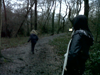
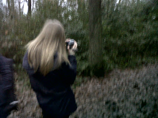
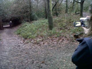
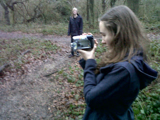
These are screen shots of us editing our footage of the title sequence. We were finding what effects we should add in between each cut and also effect we should put over the C.E.S productions logo. We choose a fuzzy/shaking horror effect to go with the logo. And we just left the cuts as they were before.
Friday, 28 January 2011
personal journal
These are screen shots of us editing our footage of the title sequence. We were finding what effects we should add in between each cut and also effect we should put over the C.E.S productions logo. We choose a fuzzy/shaking horror effect to go with the logo. And we just left the cuts as they were before.
personal journal
We got our recording done by the school band, Turtles.Unfortunately the singer Helen couldn't make it so we recorded the instruments and will record her voice next week.and put her voice over the song.
Wednesday, 26 January 2011
personal journal
In today's lesson we arranged a date to record our song by A band called the Turtles they will be playing 'creep' by Radiohead. We will be recording this tomorrow after school.
Change of plan!!!!!!
we recorded the turtles song but only the instruments. we couldn't record Helens vocals because she wasn't in. We still put the sound on to see what it would look like without the lyrics,we liked it but its wasn't exactly what we wanted. In the end we changed our music altogether and got a non copyrighted song from a website called freeplaymusic.com. The music is still a rock genre. overall i think it goes well with our sequence.
Change of plan!!!!!
We have also decided to film an opening sequence for our film. It will be Charlotte sitting in her room looking at a photo of me while the song plays in the background on a stereo. The location will be at my house in my room.we plan to get this filmed next week.
We have also decided to change this idea too because we ran out of space to put it into the timeline.
Monday, 24 January 2011
Personal journal
In today's lesson we transferred our title sequence footage from Movie maker to final cut pro. This would allow us to cut and perfect our footage. We were also deciding where to put our titles and where to put the title of the film 'Bitten'.In the end we decided to put the title 'Bitten' in the middle of the sequence.
Thursday, 20 January 2011
Institution Research
Warner Bros. Pictures
We chose this because of certain films that they have done, for example the Harry Potter films and the Batman films which relates to our dark and action part of our genre. However, they have also done films like Corpse Bride which is aimed at a younger audience but is very strange at the same time so I think that this would be perfect for our film.
Examples of films they have already distributed/produced:
- Harry Potter and the Deathly Hallows Part 1
- Inception
- Clash of the Titans
- The Book of Eli
- Sherlock Holmes
- Terminator Salvation
- The Dark Knight
- Sweeney Todd: The Demon Barber of Fleet Street
- Corpse Bride
- The Matrix
cast and crew
Wednesday, 19 January 2011
Filming Location
Today we filmed a bit more of our title sequence after school. Our filming location is in Bostall woods. We decided to film here because it is a good location for our story line it is also eerie and creepy. The weather and daylight made the woods seem even darker than it really was which gave the footage a good effect.
Friday, 14 January 2011
Personal journal
Friday, 7 January 2011
Music and sound
The sound effect that we want when c.e.s productions comes up in our title sequence would be a lightning storm sound. For example:
Another sound effect that we will need is a heart beat. we need a heart beat sound when the title Bitten comes up but before this we will have a scream which we can do ourselves.
we thought that this would be a good song to have playing through our title sequence. The music that we might have would be a song called 'creep' by Radiohead. It has slow and fast paced parts. We plan to have some friends to remake this song so that it wont be copyrighted. This song creep is appropriate for our title sequence because there are lyrics in the song that relate to the actions and movement in out title sequence.
Personal journal
Today we took pictures for the begining of our title sequence where there is a board of pictures that the evil vampire has been taking over a period of time. They are of me walking around as though i am being stalked.
These pictures are of charlotte taking pictures of me walking to show the prosess we went through. This is where charlotte took pictures from a high angle to make it look like the vampire is looking at me from above.
Font
These are some fonts that i choose from www.picnik.com. As a group we have desided to look at few more fonts because we wasnt too sure on the one we had alrady choosen. I like this one because it looks like blood is coming out of the letters which will go well with our vampire idea. Also the blood red coulour on black contrasts nicely against each other, and makes 'Bitten' stand out.
I like this one because it looks as though it has been scratched in by nails. And looks sharp that could represent fangs on the vampire.
This is our final choosen font. We want it to appear at the end of the sequence instead of at the begining with the sound of a heart beat. We have all agreed on having a blood red colour on a black background.
As our title sequence is going to be dark and gloomy our titles are going to be white, then they will show up clearly against the darkness. Our titles will show up in the corners of the screen and in the middle, we will vairy it.
Twilight clip
This clip shows the effect that we want to get when I'm being chased by the vampire. The camera is going to be in the vampires point of view so it will be a bit shaky. We are also going to film low angle shots of our feet running through the woods and up streets and through a park to show the chase. The viewer will mainly see from the waist down and the back of the characters. Like in this clip from the film Twilight the camera is in the point of view of the hunter and is also very fast pase with lots of cuts to make it more dramatic this is the effect we would like to give in our sequence.
personal journal
Today we took photos for our stalkers notice board. I had to walk down a road while Charlotte and Sonal took pictures of me. we made it look as though i didn't know they were there so it would look natural. This part is to go at the beginning of our title sequence were we introduce the evil vampire looking at the notice board.we took some pictures from a high angle which was taken from a bridge and then some were taken from behind of me walking out of school.
Wednesday, 5 January 2011
Codes and Conventions of a title sequence
.
- What are the conventions of Opening Title Sequences?
- Details of Cast and Crew (what order?).
- The Film's title.
- An introduction to character or character type.
- Indication of place.
- Indication of Historical period.
- Information regarding mood and tone.
- Introduction to signature theme tune.
- Information about genre.
- Questions that the viewer finds intriguing.
- Patterns and types of editing that will be echoed in the remainder of the film.
- Mise en scene and cinematography that will be echoed or elaborated upon later in the film
Edward Scissorhands and Sweeney Todd
I have chosen Tim Burton's film title sequences because they are dark and gloomy which is the effect that my group want to put into our title sequence. Our film isn't happy so we will be using dark, dull setting and colours to create the mood for the audience.
Both title sequences take us on a journey, in Sweeney Todd the audience follow the journey of a blood drip and in Edward Scissor hand we follow a journey through a factory. At the start of Sweeney Todd we go through a window which is inviting us into the film also in Edward Scissor hands it takes us through a door. The title sequences look as though they are mainly animated. The main colours are grays,blues and blacks but in Sweeney Todd there is bright red blood trailing through a type of factory mechanism. The red blood draws the eyes away from the titles of the names.In Edward Scissor hands the titles are in the center of the shot so therefor the audience will be looking at them. They are also quite large and white which will contrast against the black and blue making them stand out more.In Sweeney Todd the music starts off with an organ piano and then it stops and the sound is quieter and calmer but still a bit creepy. The music is just from instruments there isn't any singing or a narrator.It's the same in Edward Sicssorhands, there is just an orchestra playing instruments.I noticed at the end of both title sequences it goes for animation to real life, in Sweeney Todd the blood goes from the pies, down a drain and into some water which is real. And in Edward Scissor hands it goes from a house on a hill to an old lady standing at a window who is real.
Key elements of a Tim Burton Title sequence:
- Black,blue,gray colour
- Takes us on a journey
- creepy, gloomy
- factory
- Blood drip
- pies, cookies
- rain,snow
Class Essay
Mise-en-scene
A title sequence is the first thing the audience sees when the film starts, this being that it is very important that it gives of a first good impression. Within the film Se7en there are many things to consider in its title sequence, one of which being the mise-en-scene. Throughout this truly chilling title sequence there is no exterior or landscape shown which automatically leaves the audience with lots of questions in relation to the background information; the basic facts an average audience member would expect to know. We see a constant close up of the characters hands, never their face or body. Although we can see clearly sharp objects being used and there movement is very much the focus when they are involved in the frame. There are many different props used throughout the sequence which include: sharp objects, pen, paper, needle and thread and many old photos. Throughout the entire sequence the colour remains desaturated which we can only interpret as it having some relation to the forth coming events about to take place later on in the movie. The whole title sequence is film in a dark light setting, this suggests that the life is being drained out of the film this is also linked to how the character treats his victims. The final thing that sticks out in the sequence is that various things are highlighted in the props such as “homosexual” and “Transsexual” as well as cutting out the name “GOD” out of a clipping, to perhaps show the theme of religious belief and the connection to the person in the sequence; also the precision the person in the sequence has cold possibly be giving the audience an insight into the characters personality.
Purpose and character
From the close-ups we can’t tell what or where the location is, but we can guess that it is in a confined room. The reason why I think this is because the person who is making this book doesn't want anybody to know about it. I thought that the location was very secretive, and because the shots were so close to his hands and almost zoomed in on everything it makes you feel almost claustrophobic; which I think helped to make it feel eerie and scary. I also thought that the person was a man from the look of his hands. From this title sequence I think that he was trying to get rid of his identity by scraping off his finger prints, which made me feel really uncomfortable because it was an image I really didn't like. This suggests that he could be a serial killer and has planned things through to not get caught also this person seems to know what they are doing. There are images of dead people and it looks like he is creating a scrapbook which he has put the picture in but we aren't sure what the scrapbook is of. I also thought that he would have been a perfectionist because everything was done with his own hands and it clearly showed that he took time and care with his work and it was obviously thoroughly planned, I could tell this from the way everything seemed so precise, he seems to document his work very obssessively, but with patience. I thought that the person was religious, because they cut out a piece of a dollar bill that had the word ‘God’ written on it and also at the end of the title sequence the song ended with ‘gonna get me closer to God’, this made me think that they are killing people for their deadly sins and that they were killing for God. He crosses out words such as "transsexual" which also makes me think that he is religious. I got the idea that it was the seven deadly sins because there are two 'sevens' in the title and because the first shot after the title sequence says 'monday' which could explain one of the sevens.
Cinematography
'Seven' title sequence uses a lot of extreme close ups, this is used to create tension for the audience as it makes you feel very uncomfortable and it puts you in discomfort. Also all of these shots are still, we are only able to see the movement of the peoples body features and some of the objects. Due to the fact of these extreme close ups being still we are unable to see the surroundings and where everything is set, this is to create a big mystery which people may want to reveal by watching the whole film. Most of the lighting in this title sequence is dull; this is to create a scary and an unpleasant atmosphere. Not only the lighting is dull but also the colours included are rather dark such as brown, black, dark blue, grey. These colours give the whole title sequence a very unpleasant effect. Rays of light have been used for the main features and objects to stand out. Some of the photographs are very shaky as well as lightning has been added to them, this is to create a more unpleasant effect towards the audience, as this type of effect may reflect a scary storm at night. Fast pace has been also included to flick through a lot of things creating excitement towards the movie, leaving the audience wanting more. This title sequence also includes flashes of red which create an effect of danger. Layering is one of the things that has been used but not so much, it shows photographs fading out onto other photographs. The letters and numbers are hardly visible as a flash has been added to them which creates a mysterious side of the film. Looking at just cinematography you are able to get an idea of what the film may be about and the uses of cinematography are very strong as they create different emotions towards the audience leaving them wanting to see more, and that is the main aim of the title sequence.
Sound
The sound of the title sequence creates a disturbing feel. At the beginning it shows the character preparing to sleep, a clicking sound is used as the background which could be connoting a ticking clock counting down, showing that it is a countdown for something that is going to happen. In the sequence the character is crossing out words and pictures, every time he crosses something out you hear a scratchy screechy sound. This could be implying that the things he is crossing out are his next victims, as the screeching sound could be the person screaming and the scratchy sound could be the way they are killed. By putting this disturbing sound track in the background of the sequence with the close up images it creates a sense of confusion, as the audience has to take in the creepy sound and the glimpses of images together trying to make sense of them both at the same time.
A title sequence is the first thing the audience sees when the film starts, this being that it is very important that it gives of a first good impression. Within the film Se7en there are many things to consider in its title sequence, one of which being the mise-en-scene. Throughout this truly chilling title sequence there is no exterior or landscape shown which automatically leaves the audience with lots of questions in relation to the background information; the basic facts an average audience member would expect to know. We see a constant close up of the characters hands, never their face or body. Although we can see clearly sharp objects being used and there movement is very much the focus when they are involved in the frame. There are many different props used throughout the sequence which include: sharp objects, pen, paper, needle and thread and many old photos. Throughout the entire sequence the colour remains desaturated which we can only interpret as it having some relation to the forth coming events about to take place later on in the movie. The whole title sequence is film in a dark light setting, this suggests that the life is being drained out of the film this is also linked to how the character treats his victims. The final thing that sticks out in the sequence is that various things are highlighted in the props such as “homosexual” and “Transsexual” as well as cutting out the name “GOD” out of a clipping, to perhaps show the theme of religious belief and the connection to the person in the sequence; also the precision the person in the sequence has cold possibly be giving the audience an insight into the characters personality.
Purpose and character
From the close-ups we can’t tell what or where the location is, but we can guess that it is in a confined room. The reason why I think this is because the person who is making this book doesn't want anybody to know about it. I thought that the location was very secretive, and because the shots were so close to his hands and almost zoomed in on everything it makes you feel almost claustrophobic; which I think helped to make it feel eerie and scary. I also thought that the person was a man from the look of his hands. From this title sequence I think that he was trying to get rid of his identity by scraping off his finger prints, which made me feel really uncomfortable because it was an image I really didn't like. This suggests that he could be a serial killer and has planned things through to not get caught also this person seems to know what they are doing. There are images of dead people and it looks like he is creating a scrapbook which he has put the picture in but we aren't sure what the scrapbook is of. I also thought that he would have been a perfectionist because everything was done with his own hands and it clearly showed that he took time and care with his work and it was obviously thoroughly planned, I could tell this from the way everything seemed so precise, he seems to document his work very obssessively, but with patience. I thought that the person was religious, because they cut out a piece of a dollar bill that had the word ‘God’ written on it and also at the end of the title sequence the song ended with ‘gonna get me closer to God’, this made me think that they are killing people for their deadly sins and that they were killing for God. He crosses out words such as "transsexual" which also makes me think that he is religious. I got the idea that it was the seven deadly sins because there are two 'sevens' in the title and because the first shot after the title sequence says 'monday' which could explain one of the sevens.
Cinematography
'Seven' title sequence uses a lot of extreme close ups, this is used to create tension for the audience as it makes you feel very uncomfortable and it puts you in discomfort. Also all of these shots are still, we are only able to see the movement of the peoples body features and some of the objects. Due to the fact of these extreme close ups being still we are unable to see the surroundings and where everything is set, this is to create a big mystery which people may want to reveal by watching the whole film. Most of the lighting in this title sequence is dull; this is to create a scary and an unpleasant atmosphere. Not only the lighting is dull but also the colours included are rather dark such as brown, black, dark blue, grey. These colours give the whole title sequence a very unpleasant effect. Rays of light have been used for the main features and objects to stand out. Some of the photographs are very shaky as well as lightning has been added to them, this is to create a more unpleasant effect towards the audience, as this type of effect may reflect a scary storm at night. Fast pace has been also included to flick through a lot of things creating excitement towards the movie, leaving the audience wanting more. This title sequence also includes flashes of red which create an effect of danger. Layering is one of the things that has been used but not so much, it shows photographs fading out onto other photographs. The letters and numbers are hardly visible as a flash has been added to them which creates a mysterious side of the film. Looking at just cinematography you are able to get an idea of what the film may be about and the uses of cinematography are very strong as they create different emotions towards the audience leaving them wanting to see more, and that is the main aim of the title sequence.
Sound
The sound of the title sequence creates a disturbing feel. At the beginning it shows the character preparing to sleep, a clicking sound is used as the background which could be connoting a ticking clock counting down, showing that it is a countdown for something that is going to happen. In the sequence the character is crossing out words and pictures, every time he crosses something out you hear a scratchy screechy sound. This could be implying that the things he is crossing out are his next victims, as the screeching sound could be the person screaming and the scratchy sound could be the way they are killed. By putting this disturbing sound track in the background of the sequence with the close up images it creates a sense of confusion, as the audience has to take in the creepy sound and the glimpses of images together trying to make sense of them both at the same time.
Production Logo
We thought that our Production Logo could be of a tree that grew in a few seconds and then the company name could come up which in this case is "C.E.S Productions" which is just the initials of our names.
1. As we decided that the font of the title of our film would be in red that it could be a good idea for our production logo font to be in red. However, we thought that this didn't look that good as the colours clashed. Also, the positioning of the writing didn't look right.
2. The only colour that we thought would look right is white so we then tried it and it looked much better, giving it a more sinister feeling, as the white matched the sky.
3. This one doesn't look as good as the one before but we wanted to try different positions of where the name would go. This one didn't look good because of its position, as it took away part of the picture and made it look odd, as if it shouldn't be there.
4. This is our final Production Logo, which we think looked the best and had a good position on top of the image. It makes it look like the tree has grown out of the company name.
Subscribe to:
Posts (Atom)